
Microsoft Word
To make accessible Microsoft Word documents, click or tab to each of the following sections and expand them for the details.
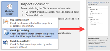
Run the Accessibility Checker
Most versions of Microsoft Word starting with version 2010 for Windows includes a built-in accessibility checker. Microsoft Word for Mac version 2011 does not have the accessibility checker, but newer versions of the product do.
NOTE: To run the Accessibility Checker, the document MUST be saved in the latest .docx format. It will not check a .doc (Word 97-2003) formatted document.
To check for accessibility on Microsoft Word 2010 for Windows and above:
- Click File > Info menu.
- Click the Check for Issues button and in the drop down menu select Check Accessibility.
- When the Accessibility Checker task pane appears next to the content, it will show the inspection results.
- Click on each issue and work through each one. There will be information below the results to assist in checking the issues.
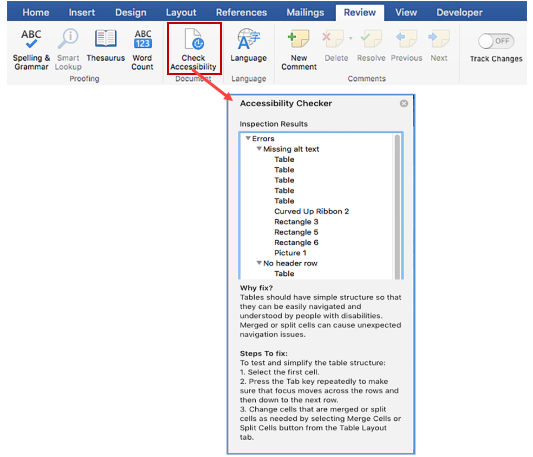
To check accessibility on Microsoft Word for Mac:
- Click Review menu and click the Check Accessibility button.
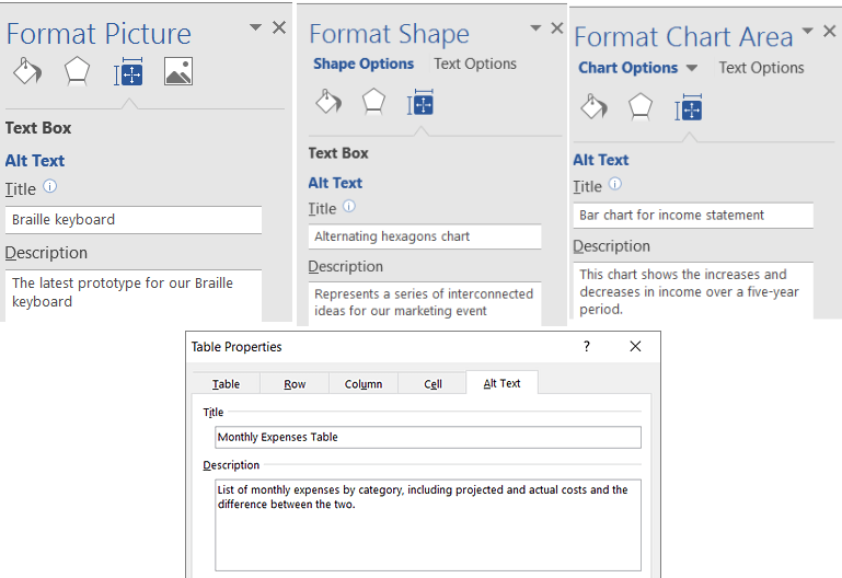
Use Alternative Text with Visual Content and Tables
Every image, SmartArt graphic, shape, chart, and table on a document need to have Alternative Text associated with them. This allows the screen readers to give a description of that object. The alternative text should clearly identify the item without being too long or too short.
To add alternative text to object in Word:
- Right-click the object.
- Go to the Properties of the Object or Table.
- Select Alt Text property.
- Type a description and a title.
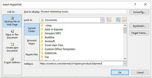
Use Meaningful Hyperlink Text and Screen Tips
When adding a Hyperlink in a Word document, make sure the link text is reflective of what the link refers to.
To add a Hyperlink:
- Select text that you want to be the hyperlink and then right-click.
- Select Hyperlink from the drop-down list.
- Review and/or modify the description for the hyperlink in the Text to display box.
- In the Address box, enter the destination address for the hyperlink.
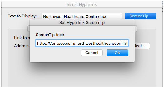
- Click the Screen Tip button to enter a screen tip that will be seen when a mouse goes over the link.
Screen Shot from Windows version:
Screen Shot from Mac version:
Use More Than Color to Convey Meaning
If there is a certain color coding for text in the document, use symbols along with colors to indicate the meaning of the color. For instance, if green indicates "success", then use a check mark along with the green. If red indicates "failure", then use an "X" along with the red. It is also possible to add graphics along with Alt Text to indicate these meanings.
Use Sufficient Contrast for All Visual Content, Text, and Backgrounds
Typical contrast ratio for accessibility is 7:1. Use text colors, background colors, and graphics that maintain this ratio.
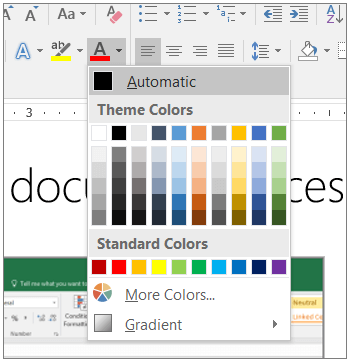
For text, it is recommended to format font colors using Automatic. It is also recommended to stay within the Theme colors for best color choice.
There is a tool called Colour Contrast Analyser that will help to determine ratios between two colors.
Use Built-In Headings and Styles
To ensure proper headings in the Word document, use the built-in Headings and Styles provided. These styles are pre-coded to align to the H1, H2, H3, etc. heading tags for web pages and allow screen readers to organize the headings. The styles themselves can be edited per document or saved as a global default setting.
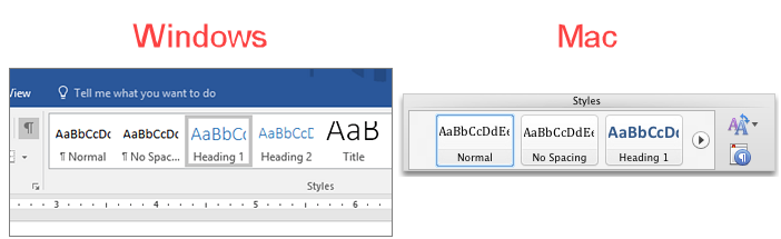
To choose a style, pick from the list displayed under the Home tab.
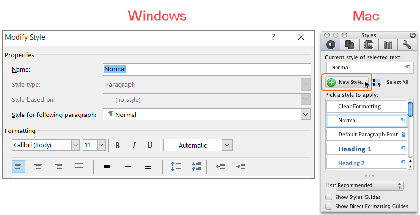
To edit a style in Windows, right-click the style and click Modify. On a Mac, under Styles, click the Manage the styles that are used in the document.
Use Bulleted or Numbered Lists
When there is a list of items to display in the document, use bulleted or numbered lists. Screen readers are able to understand how the content is organized and how many items are in the list.
To use bulleted or numbered lists, list all of the items in the document. Select the text of all of the lines and then click either bulleted or numbered list from the Paragraph tab.
Text and Paragraph Spacing
Keep all text left aligned. Text should have adequate "white space" to improve overall readability.
Paragraphs should be distinguishable with "white space" between each other.
Use Simple Table Structures and Specify Header Information
Tables should be used sparingly for accessible documents. Try to keep the table structure as simple as possible and if there a complex structure, break it down into smaller simple tables. Make sure there is a header row for each column and do not use merged cells in the tables. Use the Table Tools to edit the table options.